Price with selected options


Taupe is the most grounded color in the Greenscape range — a warm grey-brown with genuine depth that adds presence to a room without demanding attention. At 203 GSM this eco semi-sheer filters light into something rich and settled. The neutral you stop searching for once you've found it.
Taupe sits at the intersection of warm grey and brown — it has the earthiness of a natural material and the composure of a true neutral. It's warmer than Metal or Dove, more complex than Biscuit, and deeper than Pearl or Daisy. In afternoon light it develops a rich, settled quality; in morning light it reads lighter and more open. It grounds rooms that feel too pale or too cool, and adds depth to spaces that need anchoring. It's a color that works from the walls outward or from the curtains inward.
At 203 GSM this is a structured semi-sheer with real weight behind it. Taupe's depth means the diffused light that comes through has a warm, amber-brown quality in strong afternoon sun — a characteristic that earthy, organic, and warm-neutral interiors turn into a feature rather than a problem. The 51% recycled polyester blend adds an eco dimension to a color palette that already speaks to natural materials and considered choices.
Easy Clean means everyday marks are handled without fuss. Machine wash at 40°C, near-zero shrinkage. The Taupe tone is forgiving — it doesn't show light dust or minor marks the way paler colors can, which reduces visible maintenance intervals without any reduction in actual cleanliness. Spill-resistant, odor-resistant, child and pet-friendly.
Taupe suits living rooms, studies, and bedrooms in organic, earthy, and contemporary interiors. It pairs with warm timbers, terracotta, stone, olive green, dusty rose, and deep navy. Layer with a blockout in a complementary warm neutral for day-to-evening versatility without jarring color shifts.
Every panel is made to your dimensions. Your heading, your drop, your width — cut to order.
The Serene Sheers Greenscape collection accommodates:
• Living rooms and open-plan spaces where filtered light and a degree of daytime privacy are both needed
• Dining rooms and entertaining areas for soft afternoon light without full exposure
• Bedrooms where lightweight voile is too sheer but full blockout is too dark
• Home offices where diffused daylight reduces screen glare without closing the room off
• Sunrooms and conservatories where structure and eco credentials both matter
• Layering over a blockout panel for complete day-to-evening light control
• Custom drops from 90 cm to 300 cm — made to your exact window measurement
Why Choose Our Taupe Eco Sheer Curtain?
• Taupe colorway — warm grey-brown with earthy depth, grounding and versatile in organic, natural, and contemporary interiors
• 51% Recycled Polyester Blend — made with recycled fibres for a smaller environmental footprint without sacrificing performance
• Custom-fit to your exact drop and panel count — made to order for a precise, polished hang at any window
• 203 GSM semi-sheer weight — more structure and daytime privacy than lightweight voile, with natural light still flowing through
• Easy Clean — machine washable at 40°C, practical for everyday use in any room
• Near-zero shrinkage — custom drop stays accurate through repeated washing cycles
• Spill and stain resistant — everyday protection built into the fabric
• Child and pet friendly — practical for busy households without compromising on style
• Multiple top type options available — Grommet, Tab Top, Rod Pocket, Sleeve Top
• Odour resistant — stays fresh between washes
The Greenscape is a 203 GSM semi-sheer woven from a blend of virgin and recycled polyester fibres — 24% Polyester Filament, 25% Polyester Spun, 18% Recycled Polyester, and 33% Recycled Spun, giving a total recycled content of 51%. The combination of filament and spun yarns creates a fabric with a soft, slightly textured surface and a gentle sheen. At 203 GSM, it carries more body and structure than a lightweight voile, providing better daytime light filtering and a degree of privacy while still allowing natural light to flow through. Easy Clean performance is built into the fabric — spill resistance, stain repellency, odour resistance, and machine washability are inherent to the fibre structure rather than applied as a surface coating. Machine washable at 40°C with near-zero shrinkage and colorfast through regular care.
Fabric Specifications at a Glance:
| Fabric Composition | 24% Polyester Filament + 25% Polyester Spun + 18% Recycled Polyester + 33% Recycled Spun |
| Fabric Type | Plains |
| Weight | 203 GSM |
| Panel Width | 140 cm |
| Length | Custom — made to your measurement |
| Care | Spot Clean + 40°C Wash Only, Non Chlorine Bleach, Low Tumble Dry, Low Iron, Dry Clean |
| Specialty | Spill & Stain Resistant, Easy Clean, Machine Washable, Near-Zero Shrinkage, Child & Pet Friendly, Odour Resistant |
| Collection | Serene Sheers — Greenscape Range |
• 203 GSM semi-sheer weight — more structured and private than lightweight voile while staying genuinely light-filtering
• 51% Recycled Polyester Blend — eco-conscious fabric choice with no compromise on performance or durability
• Easy Clean technology — spot clean for quick fixes, 40°C machine wash for a full refresh
• Near-zero shrinkage — your custom drop holds its measurement wash after wash
• Spill and stain resistant finish — repels everyday splashes before they absorb
• Odour resistant — ideal for living rooms, dining areas, and high-traffic spaces
• Child and pet friendly — soft, non-snag fabric for real-life family homes
• Made to measure — every panel cut to your exact window dimensions
• Multiple hanging options — Grommet, Tab Top, Rod Pocket, or Sleeve Top
• 140 cm panel width — generous sizing for full, layered coverage across standard and wide windows


The cushions are beautiful. The vacuum pack shipping worked great for us because we were able to transport them to our cottage in the compressed form and were able to free them and try them out on the furniture before we stored it for the season. Everything was exactly as ordered. And we liked the fabric even better than in the pictures.
They are perfect!!!
Very helpful to get swatches
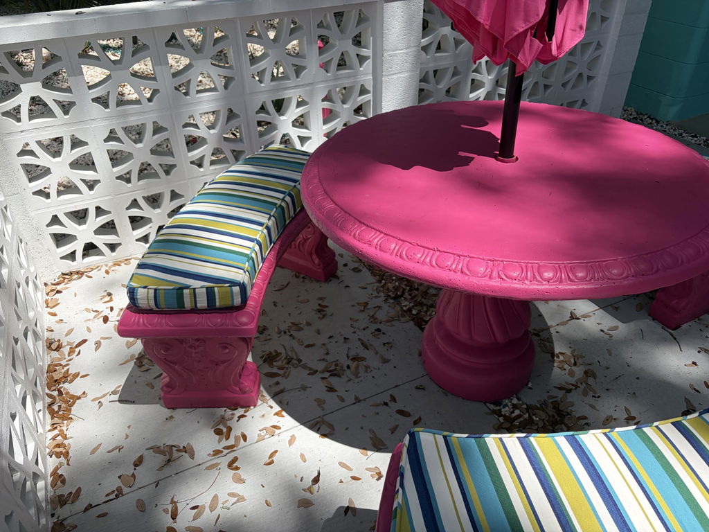
We had several a curved bench seats. The curve is subtle as far as measurements go, but becomes more exaugurated with the length of the bench. They did a great job. Couldn't reasonable be happier, and the cushions were delivered on time too.
Well made and fit perfectly.
The cushion is perfect and came very quickly. Great quality and so well made. The estimated time was 3-4 weeks and it was here in a week and 1/2.
turned out perfect. highly recommend
It fit perfectly.
Thank you, just what I wanted! And arrived earlier than expected! 😊
Wow. Zip Cushions is awesome. We ordered backs from another supllier because they were big time on sale. They didnt have enough remaining to also get the bottpm cushion. I ordered a bunch of fabric swatvhed from Zii Cushions to see what would look best. Zip Cushions has the best selection of fabrics ive seen hands down. Then webirdered custom bottom cushions and they are perfect. They teached out before making them to be sure the ties and details we entered online were correct. And the cushikns got here so fast its hard to helieve they were madenjust for us. Excellent everything!


 more..